ABOUT OUR LOGO
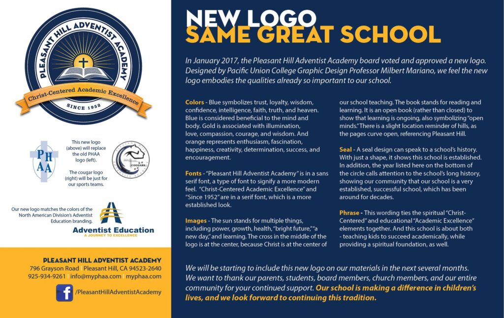
In January 2017, the Pleasant Hill Adventist Academy board voted and approved a new logo. Designed by Pacific Union College Graphic Design Professor Milbert Mariano, we feel the new logo embodies the qualities already so important to our school.
Colors – Blue symbolizes trust, loyalty, wisdom, confidence, intelligence, faith, truth, and heaven. Blue is considered beneficial to the mind and body. Gold is associated with illumination, love, compassion, courage, and wisdom. And orange represents enthusiasm, fascination, happiness, creativity, determination, success, and encouragement.
Fonts – “Pleasant Hill Adventist Academy” is in a sans serif font, a type of font to signify a more modern feel. “Christ-Centered Academic Excellence” and “Since 1952” are in a serif font, which is a more established look.
Images – The sun stands for multiple things, including power, growth, health, “bright future,” “a new day,” and learning. The cross in the middle of the logo is at the center, because Christ is at the center of our school teaching. The book stands for reading and learning. It is an open book (rather than closed) to show that learning is ongoing, also symbolizing “open minds.” There is a slight location reminder of hills, as the pages curve open, referencing Pleasant Hill.
Seal – A seal design can speak to a school’s history. With just a shape, it shows this school is established. In addition, the year listed here on the bottom of the circle calls attention to the school’s long history, showing our community that our school is a very established, successful school, which has been around for decades.
Phrase – This wording ties the spiritual “Christ-Centered” and educational “Academic Excellence” elements together. And this school is about both – teaching kids to succeed academically, while providing a spiritual foundation, as well.